Media Control Bar
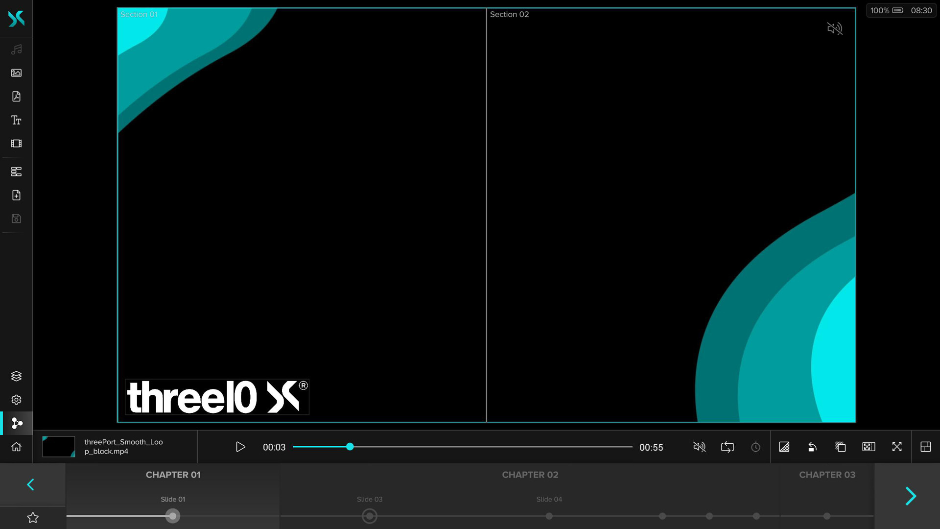
After selecting a Layer on the Canvas, the corresponding Media Control Bar appears at the bottom. By clicking on the thumbnail, next to which the name of the selected Layer is also displayed, you can hide or show it.
The elements on the right and left edges of the Control Bar are the same for Layers of all media types:
Delete
Removes the selected Layer from the Canvas.
Transparency
Sets the transparency level of the selected Layer, ranging from 0% to 100%.
Rotate
Rotates the selected Layer counterclockwise in 45° steps. For Audio Layers and Video Source Layers with Aquilon/Spyder Pixel Processor no rotation is possible and this button is hidden.
Background Color
Allows you to change the background color of the Layer. The background color is displayed for Layers with a transparent background or for Layers whose aspect ratios are different to the Canvas or Section when full-screen mode is enabled.
The Color Picker provides the following choices of a color including alpha:HEX, RGB, HSV and an eyedropper , which can be used to select colors of the current content and the UI with pixel precision. In the lower area color presets can be added with +, removed with x and applied by clicking on a preset. These can also be defined in advance in the the X-Manager (administrator rights required). They are not synchronized between the X-Creators.
Section Fullscreen
Displays the selected Layer at full size in its Section while keeping the aspect ratio. Clicking again restores the original size. If there is no Section or only one that is congruent with the Canvas, the behavior is analogous to the fullscreen button.
Fullscreen
Displays the selected Layer in full-screen mode. The Layer is enlarged to the full size of the Canvas while the aspect ratio is maintained. Clicking again restores the original size.
Audio
Audio Layers are hidden by default after being added and must be selected via the Layerlist or set visible there and then selected on the Canvas to show the Media Control Bar.
Play/Pause
The audio clip is played or paused.
Time Slider
Shows how much of the audio clip has already been played. In addition, the elapsed time is displayed on the left and the length of the audio clip on the right. It is possible to jump to time points in the audio clip by moving the slider.
Volume
Opens a slider that can be used to adjust the volume. Clicking on the / icon mutes the audio clip or sets it back to the previous volume.
Loop
Allows to set the audio clips playback mode. If this button is active, the clip will start from the beginning again after it finishes playing. If this button is disabled, the audio clip will be stopped after playing and set to the beginning.
Image
Trigger
A trigger can be assigned to the Layer, which then calls up the next Slide or an Experience previously defined in the X-Manager when the image is clicked. If a trigger is assigned to the image, the icon appears in the upper right corner of the Layer.
Stereo
If the 3D Stereo module is active, this button is displayed, with which the Stereo Mode of the Layer can be enabled, if the image available in stereo.
Shape
Fixed Aspect Ratio
Locks the aspect ratio of the layer to ensure shape is not warped if not wanted. Enabled by default.
Color
Opens the Color Picker, which can be used to set the shape color. The Color Picker provides the following choices of a color including alpha:HEX, RGB, HSV and an eyedropper , which can be used to select colors of the current content and the UI with pixel precision. In the lower area color presets can be added with +, removed with x and applied by clicking on a preset. These can also be defined in advance in the the X-Manager (administrator rights required). They are not synchronized between the X-Creators.
Previous/Next Page
Allows you to navigate to the previous or next page of the PDF document.
First/Last Page
Jumps to the first or last page of the PDF document.
Page Slider
Displays the position of the current page in the PDF. To the right, the current and the total page number of the PDF are displayed. By moving the slider or clicking on it, you can navigate through the PDF.
Interaction
Activates the interaction mode. The layer can no longer be moved or scaled, but the user scrolls through the PDF with the mouse or by touch. If another page change is triggered on the last page of the PDF, the interaction mode is automatically deactivated and the slide navigation is active again.
NDI® Stream
Volume
Opens a slider that can be used to adjust the volume of the stream. By clicking on the icon the stream can be muted or set back to the previous volume.
Stereo
If the 3D Stereo module is active, this button is displayed, with which the Stereo Mode of the Layer can be enabled.
Color Space
Opens a drop-down menu that allows you to specify the color space in which the stream is received. RGB results in better image quality, but requires slightly more bandwidth. YUV provides slightly worse quality at lower bandwidth and is suitable when not enough performance is available.
Resolution
Opens a drop-down menu that allows you to specify the resolution at which the stream is received. At High-Res the stream is received in full resolution. At Low-Res the width is reduced to 640 pixels and the height adjusted depending on the aspect. Thus Low-Res offers itself on devices with less performance or if many streams are received in one Slide.
Remote Control
Displayed when the received stream is from an X-Stream application. If the function is activated, the mouse and keyboard of the computer sending the stream can be controlled as soon as the Layer is clicked. Clicking outside the Layer will stop the transmission. If the transmission is active, this icon is also displayed in the upper right corner of the Layer.
PTZ-Camera Control
If the received stream is from a PTZ camera, the following additional functions are available:
Move
Opens a joystick that can be used to move the camera.
Zoom
Opens a menu with two buttons that can be used to adjust the zoom of the camera.
Focus
Opens a menu with three buttons that can be used to adjust the camera's focus and activate autofocus.
Exposure
Opens a menu with three buttons that can be used to adjust exposure and activate auto-exposure.
Preset 1, 2, 3
Open a menu with two buttons. can be used to save the current camera setting as a preset. The other one is either to call up a saved preset or to remove the selection. The selected preset is highlighted by being underlined and saved with the Slide. So when loading the Slide the preset, set in the Layers, is loaded on the camera.
Attention: Presets are not stored in the software, but on the camera. This means that they can be overwritten by other programs or lost for some other reason (e.g. reset of the camera). Then when loading a preset via the X-Creator, the settings with which it was overwritten are loaded or nothing happens if the preset was deleted.
Text
Font
Opens a drop-down menu that allows you to specify the font of the text. By default the fonts Arial, Times New Roman, Ubuntu and Gotham are available. Additional fonts can be uploaded for an Environment.
Font Color
Opens the Color Picker, which can be used to set the font color. The Color Picker provides the following choices of a color including alpha:HEX, RGB, HSV and an eyedropper , which can be used to select colors of the current content and the UI with pixel precision. In the lower area color presets can be added with +, removed with x and applied by clicking on a preset. These can also be defined in advance in the the X-Manager (administrator rights required). They are not synchronized between the X-Creators.
Font Size
Adjusts the font size. The current font size is displayed between the buttons. The percentage value indicates the relative size of the font in relation to the Canvas.
Horizontal Alignment
Sets the horizontal alignment of the text. Left-aligned, right-aligned, or centered.
Vertical Alignment
Sets the vertical alignment of the text. Top-justified, bottom-justified, or centered.
Interaction
Activates the interaction mode. The Layer can no longer be moved or scaled by a pinch gesture or with the right mouse button, but the text can be edited directly.
Video
Play/Pause
The video will be played or paused.
Time Slider
Shows how much of the video has already been played. In addition, the elapsed time is displayed on the left and the length of the video on the right. By moving the slider it is possible to jump to time points in the video.
Volume
Opens a slider that can be used to adjust the volume. By clicking on the icon, the video can be muted or reset to the previous volume. The mute button is also located in the upper right corner of the Video Layer.
Play Mode
Allows you to set the playback mode of the video. By default videos are set to Loop and start again from the beginning as soon as they have finished playing. With Reset after Play a video is stopped after playing and set to the beginning whereas Play to End stays at the last frame. Forward Slide loads the next Slide as soon as the video finishes.
Stereo
If the 3D Stereo module is active, this button is displayed, with which the Stereo Mode of the Layer can be enabled, if the video is available in stereo.
Timecode
If the Video Timecode module is active, this button is displayed, with which the current video time is sent to the configured receiver. If the button is activated, the video will be stopped and the time will be set to 0. Furthermore the play mode is set to Play once. When the video is played now, the current time of the video will be sent. The timecode function is not saved in the Slide and must be activated manually when the Slide is reloaded.
Video Source
Volume
Opens a slider that can be used to adjust the volume. By clicking on the icon, the video source can be muted or reset to the previous volume.
Color Space
Opens a drop-down menu that allows you to specify the color space in which the video source is received. RGB results in better image quality, but requires slightly more bandwidth. YUV provides slightly worse quality at lower bandwidth and is suitable when not enough performance is available.
Frame Skip
Opens a drop-down menu to set the frame rate at which the video source is received. With No Frame Skip the source is received in full frame rate, with 1 Frame Skip only every 2nd is frame received, with 2 Frame Skips every 3rd and with 3 Frame Skips every 4th frame. With this setting performance can be saved, e.g. if several high-resolution video sources are received at the same time.
Stereo
If the 3D Stereo module is active, this button is displayed, with which the Stereo Mode of the Layer can be enabled, if the video source is available in stereo.
Audio/USB Routing
If audio and/or USB routings have been set up in the X-Manager (prerequisite is the integration of corresponding systems, e.g. Crestron or Audio DSP), further functions are available which are displayed in the Control Bar:
Audio
Enables/disables audio from the selected source. Audio routing is limited to one source at a time. If audio was previously enabled on one video source and is now enabled on another, the first will automatically lose audio routing.
USB
Enables/disables USB routing from the selected source. Several free slots can be defined in the X-Manager to activate USB routings for several sources at the same time.
Web
Navigation
Provide the standard functions of a web browser to go to the previous or next page in the history or to refresh the page.
URL
Displays the URL of the currently displayed page and allows users to edit the URL to load new pages. After input, confirm with enter to load the new page. The button to the right of the address bar deletes the current entry.
Zoom
Allows to adjust the zoom of the browser window in 15% steps up to a minimum of 25% or a maximum of 500%. 100% corresponds to the display on a screen with HD resolution.
Interaction
Activates the interaction mode. The Layer can no longer be moved or scaled by a pinch gesture or with the right mouse button, but can be interacted with directly on the Layer using the web browser. All mouse inputs on the Layer are passed on to all other X-Creators, while keyboard inputs are not synchronized. Only one X-Creator can have the interaction mode activated on a web Layer. When it is activated, it is deactivated on all other X-Creators.
Delete Cookies
Deletes all cookies from the browser. This means that all logins will be lost and all cookie dialogs will reappear.
Fixed Resolution
Only displayed if a fixed web browser resolution has been configured for this X-Creator in the X-Manager. This resolution can be activated with this button for the respective Web Layer, so that the Layer does not have to be reloaded when its size is changed.
3D Asset
/ Play/Pause
If an animation is present in the selected 3D asset, it will be played or paused.
Interaction
Activates the interaction mode. The Layer can then no longer be moved or scaled by a pinch gesture or with the right mouse button, but it can be interacted directly with the 3D Asset on the Layer. The left mouse button is used to rotate the asset and the right mouse button is used to zoom in/out the content.
Stereo
If the 3D Stereo module is active, this button is displayed, with which the Stereo Mode of the Layer can be enabled, if the 3D Asset is available in stereo.
- NDI® is a registered trademark of NewTek Inc.