Control UI
Main Menu
The -button in the upper left corner can be used to show or hide more detailed descriptions of the menu buttons.
This chapter describes all functions of the standard interface. If further buttons appear, they are module-specific and are described in the documentation of the respective module.
Media Menu
All buttons up to the first visual subdivision of the Sidebar represent the different types of media that can be added to the slide. They form the Media Menu. Which media types are displayed can be defined in the X-Manager (administrator rights required). The possible media types are:
- Audio
- Image
- NDI® Stream
- Shape
- Text
- Video
- Video Source
- Web
- 3D Asset
This buttons open a Media Browser in which all media of the respective type uploaded to the X-Manager are displayed. Each media is represented by a thumbnail and its name. If no media has been uploaded for the type, the icon is grayed out. In the Media Browser, the media are divided into two groups, each labeled with a heading. The Experience Media, which can be used exclusively in the currently loaded Experience and were also uploaded there in the X-Manager, and the Public Media, which were uploaded in the X-Manager via Public Media and are available for all Experiences. When media are added or deleted in the X-Manager, these changes are visible directly in the Media Browser.

The NDI® streams are divided into streams from the local network and streams that are received via an NDI® Bridge. If the name of a stream is displayed in grey instead of white, this means that the source of the stream is currently not available on all X-Creators with enabled NDI® media support.
By selecting one or more media and then activating the -button at the bottom of the Media Browser, Layers with the selected media will be created and added to the current Slide. The new Layers are placed in the center of the Slide. Individual elements can also be dragged and dropped directly from the Media Browser to the desired position on the Slide. If there is at least one Layer of a media on the current slide, the number of Layers of this media is displayed in the upper right corner of the preview image in the Media Browser.
Using the arrow in the upper right corner of the media browser expands the browser over the entire screen, the functionality remains the same.
With the Media Browser for Text and Web, there is an additional - and -button, which allow creating and removing media in the X-Creator. These media are also added/removed in the X-Manager.
Slide Menu
The buttons , and belong to the Slide Menu.
New Slides can be created with the -button. Then a name for the Slide must be entered.
The -button saves the status of the current Slide. (Attention: no automatic saving)
Clicking the -button opens the Slide Browser, which displays all Slides and Chapters contained in the Experience. By holding down and moving the Slides or entire Chapters, the order can be changed.
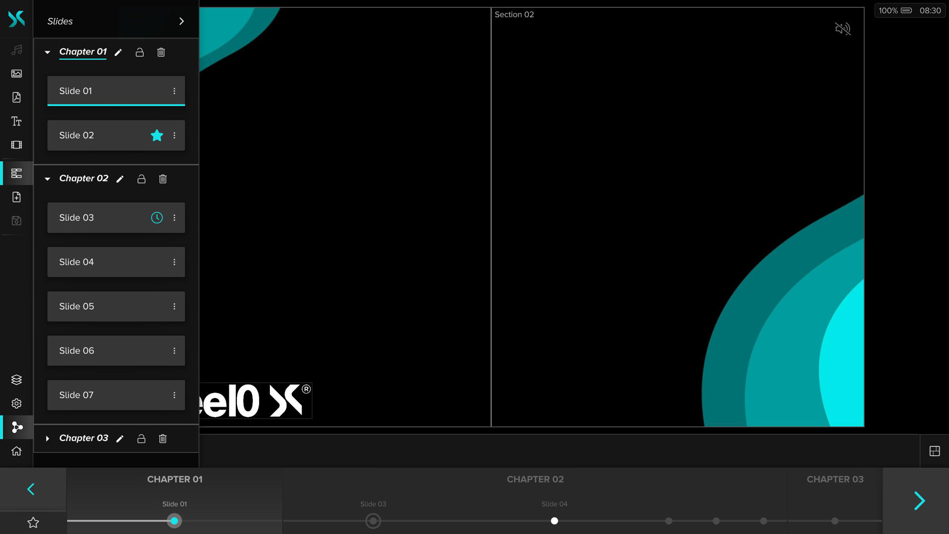
The three icons next to the name of a Chapter can be used to rename , lock and delete the Chapter together with all the slides it contains. If a Chapter is locked, it can no longer be moved and no slides can be added or removed.
By clicking the -button to the right of the Slide name, you can open the Context Menu where you can perform additional actions for the Slide:
Rename
Rename the Slide
Duplicate
Create a copy of the Slide
Delete
Delete the Slide
Timer
Automatically advance the Slide after the set time in seconds has elapsed. If a timer is set, it is displayed below the right Slidebar arrow and can be stopped and started by clicking.
Favorite
The Slide is taken out of the Experience sequence and made permanently available. The Favorite Slide can then be loaded and deactivated again via the Favorite button below the left Slidebar arrow. There can only be one Favorite Slide.
Use the arrow next to the menu name to expand the Slide Browser.

In the extended view, new Slides or Chapters can also be created using the Add Slide and Add Chapter buttons.
Web Window
If the Web Window has been activated and configured in the X-Manager (administrator rights required), another button appears below the buttons of the slide menu whose icon depends on the configuration in the X-Manager. This button opens a browser in the expanded menu with the website stored in the configuration. The browser can then be interacted with. There is no address bar, forward, back or refresh button.
Action Menu
The buttons , , and at the bottom of the Sidebar belong to the Action Menu.
Layerlist
Use the -button to show or hide the Layerlist. It shows all Layers of the current Slide and in which layer-category they are located.

By pressing the -button, a Layer is locked and can then no longer be selected or moved on the Slide. By clicking on the preview image of the Layer, it can be shown or hidden.
By clicking the -button to the right of the Layer name, you can open the Context Menu where you can perform additional actions for the Layer:
Delete
In the Layerlist, individual Layers can be deleted by activating the trash icon. The media remains available and can be placed on the Canvas again at any time.
Static
The layer can be set as a Static Layer for all Slides. With this function, the Layer remains in its position even when the Slide is changed and doesn't get removed.
Foreground/Regular/Background
By activating the corresponding layer-category a Layer can be moved to it. Moving by drag and drop is also possible.
Widget
On a device with Control UI enabled, you can enable Layer as a Widget. This will display the Layer only on devices with an active Control UI.
Settings
Pressing the -button opens the Settings Menu, where the following settings can be made:
Black Screen
When enabled, all Visualization Devices show only a black screen instead of the content. Disabled by default.
Freeze
Stops playing all Layer media files on the current Slide when enabled. Disabled by default.
Unsaved Warning
Displays a warning when switching Slides if changes have been made to the current Slide and it has not yet been saved. Disabled by default.
Sync
The Sync function allows an X-Creator to decouple itself from other clients. No experience, Layer or Slide interactions are synchronized. X-Creators that have decoupled do not react to any of these operations from others.
If the Sync button is deactivated, it is possible to make changes to Slides of this and other Experiences, while all other X-Creators continue to display the state before decoupling. It is possible to switch between Experiences, navigate through Slides, add or remove Layers as desired.
Caution: If changes have been made, make sure that the Slide has been saved before activating the Sync function.
If the Sync button is activated within an experience, the current X-Creator follows the other clients in order to be up to date with the current presentation. This takes place both within an experience and across experiences (with renewed confirmation through a dialog). When the Sync button is activated on the Welcome screen, no Experiences are automatically loaded. The user now has the option to load any experience on all X-Creator.
Caution: Since all X-Creators with activated Sync are on the same level, an Experience is automatically loaded if there are already X-Creators with activated Sync in it when a client is started.
Home Button
With the -button you can leave the Experience and return to the Experience Screen.
Layout Menu

The Layout button located next to the Media Control Bar toggles the layout menu on the right side with various controls.
Section Focus
If the Canvas contains at least one Section, there is a -button. When clicked, it focuses on the next Section and displays it as large as the whole Canvas. When you reach the last Section, the normal view is restored and the entire Canvas is shown.
Sort on Click
Enable/disable Layer sorting on Layer select (Enabled by default)
When a Layer is selected on the Slide, it automatically moves to the foreground of its layer-category.
Snapping
Enable/disable Layer Snapping (Enabled by default)
When moving, scaling, and cropping Layers, snapping lines are shown when the selected Layer is moved within a certain tolerance range. This allows you to place Layers in relation to the positions of other Layers, the Grid or custom Guides.
Grid
Show/hide Grid
Increase/decrease Grid Size
A grid with various dimensions can be shown to uniformly align and position Layers, which are saved automatically per Experience.
Guides
Show/hide custom Guides
Lock custom Guides
Add horizontal/vertical custom Guide
Remove selected custom Guide
Custom guides can be added and removed as needed to add layout assistance. These are automatically saved per Experience. By locking the guides, user input interaction is disabled, but snapping remains unchanged. The position of the selected guide on the canvas can be set with drag & drop.
Alignment/Distribution
Enable/disable alignment mode
If alignment mode is enabled, multi-Layer selection is possible for aligning and distributing selected Layers (fullscreen layers are ignored).
Horizontal Align Left
Horizontal Align Center
Horizontal Align Right
Vertical Align Top
Vertical Align Center
Vertical Align Bottom
Vertical Distribute
Horizontal Distribute
Slidebar
Slides can be changed on the Control Device using the colored arrow keys . Alternatively, the Slides can also be changed with the arrow keys on the keyboard or with a connected presentation device. The Slides can be scrolled by dragging them to the left or right or selected by clicking/touching. As soon as a Slide is selected, a colored icon appears , which can be used to activate and display this Slide. If a Favorite Slide is set, the -button appears under the left arrow key and if a timer is set for the current Slide, it appears under the right arrow key. The timer can be stopped and restarted by clicking on it.
- NDI® is a registered trademark of NewTek Inc.